Artist
Magazine
Nov 11, 2025 | Written by Micah Watanabe
Front cover the magazine featuring Paul Cézanne
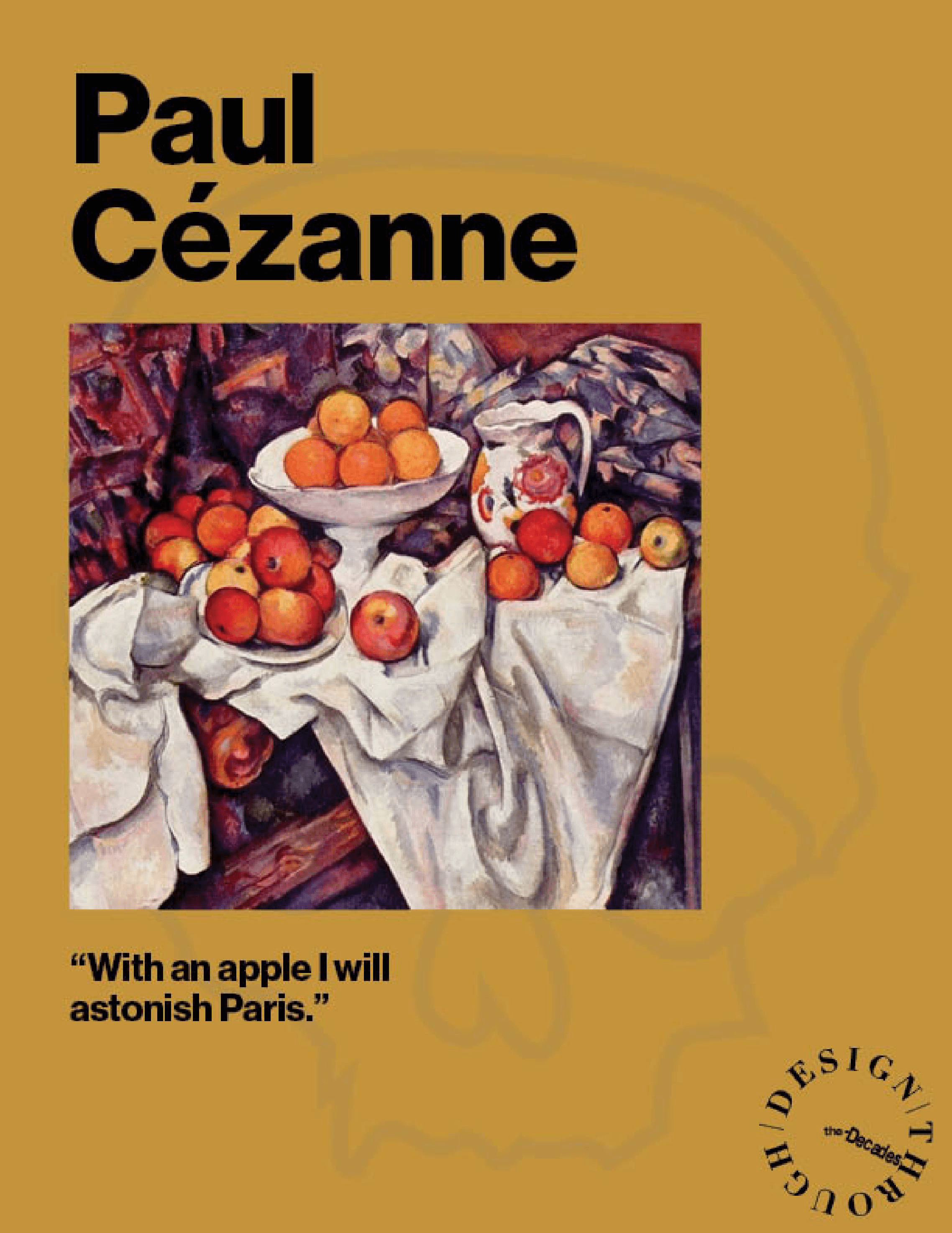
For the Design through the Decades magazine line, featuring the unique backgrounds and art styles of prominent artists, I created an 18-page magazine using Adobe InDesign. Covering Paul Cézanne, an artist from Aix-en-Provence, France, the original idea heading into designing the magazine was to cover his famous works and characteristics that made him prominent during the Post-Impressionist movement.
Picture of Paul Cézanne (left) and his painting of Montagne Sainte-Victoire (right)
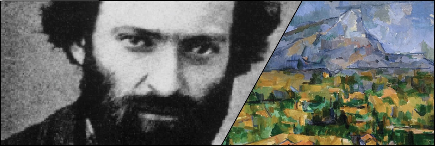
Through research on his upbringing and lasting legacies, I discovered his importance in the Cubist era. Prominent artists during the Cubist era, such as Pablo Picasso, deemed him "My one and only master". To show his importance in both eras, I included famous paintings to highlight his Post-Impressionist style, but also included illustrations created (by me) through Adobe Illustrator to show characteristics that align with Cubist methodologies, such as value and form. This ended with me creating a cohesive magazine that first highlights his career, inspirations, and importance for the Post-Impressionist movement, but also the lingering inspiration he left for following generations.
The Challenge
Early Drafts (left) and my final draft + design (right)
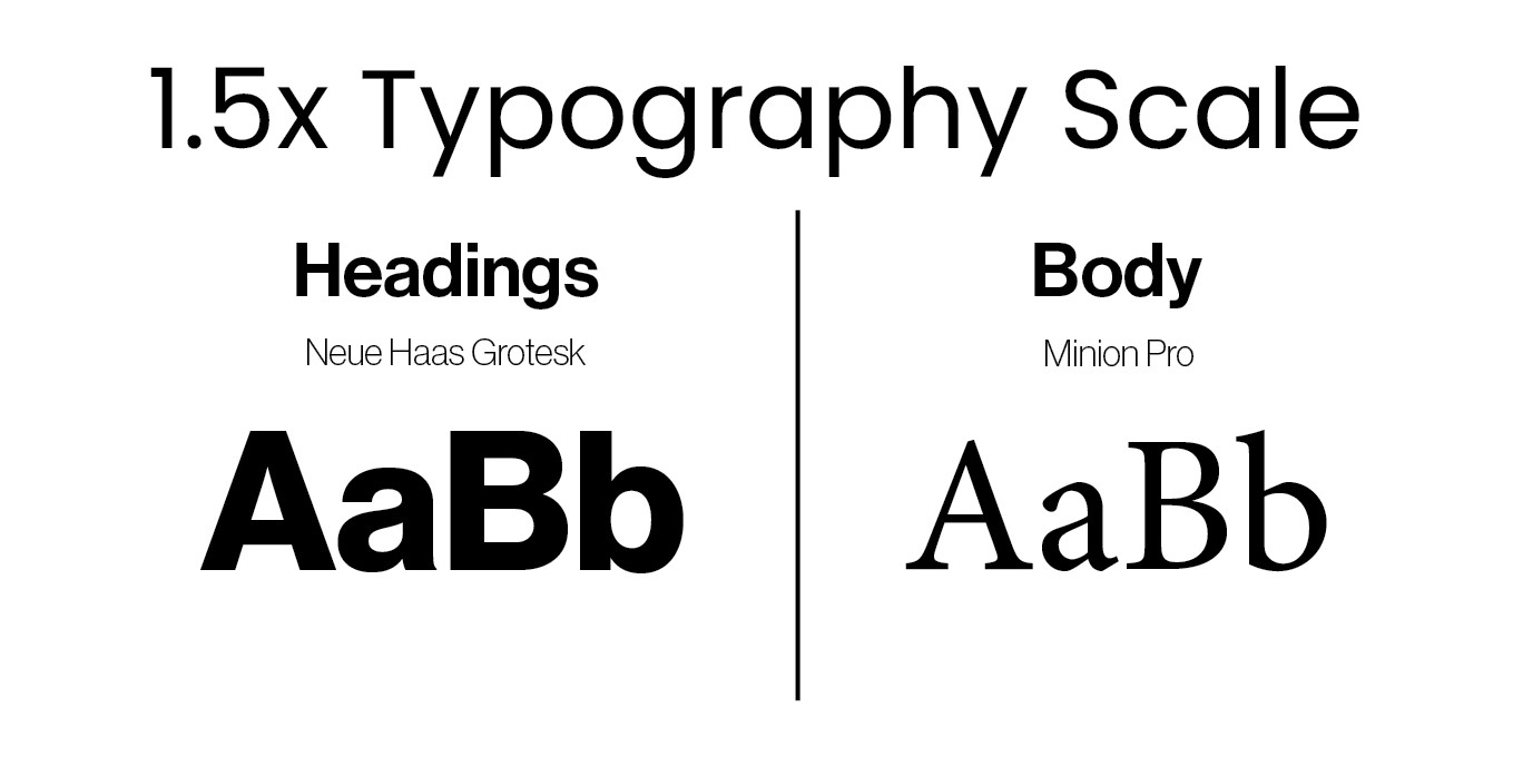
The typographic scale and fonts used in the magazine
Design Journey
During the design process, there were multiple technical aspects, as well as historical knowledge about the artist that I needed to know. One of the technical aspects I needed to think about was how I would proportion the size of my typography. This included extensive combinations using select systems: Rule of 8s, golden ratio, and a 1.5x scale, where I ended up using Neue Haas Grotesk Display Pro for my headers and Minion Pro for my body text. I thought the 1.5x scale would allow me to utilize scale to large proportions quicker than the other methods, and the text provided simplicity with the headers, but an emotion of elegance for the body text (similar to Cézanne).
A part of learning to create a cohesive magazine was learning the program I would be making it on, Adobe InDesign. Although similar to other Adobe products that I have used in the past, formatting for a 2-page format was new to me. A concept I found difficult was evenly spacing text boxes to look like a magazine. Through the recreation of a Jessica Svendsen's Yale School of Architecture poster, I was able to practice my use of typographic hierarchy, spacing, and illustrations within a magazine setting.
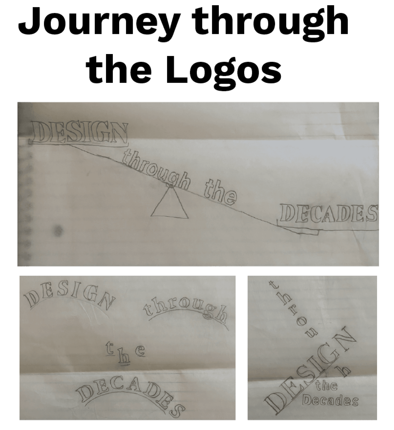
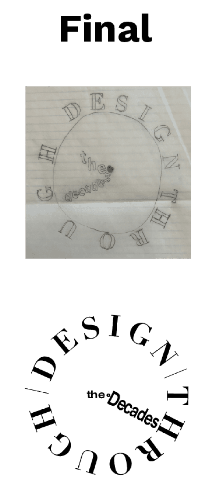
Creating a journal logo was important for creating a “blast to the past” emotion while reading. Although many designs were made, some even tried to play off Cézanne’s art style and time period. However, none felt as unique and easy to read with the chosen logo styled as a clock. The outside was sized and formatted so that the “through” would end where “the” was located to not break the flow. While looking at “the decades”, your mind subconsciously makes a circle, playing off Gestalt’s principle of closure. Also, the idea of Cézanne’s art being influential through time was an idea I wanted the logo to portray.
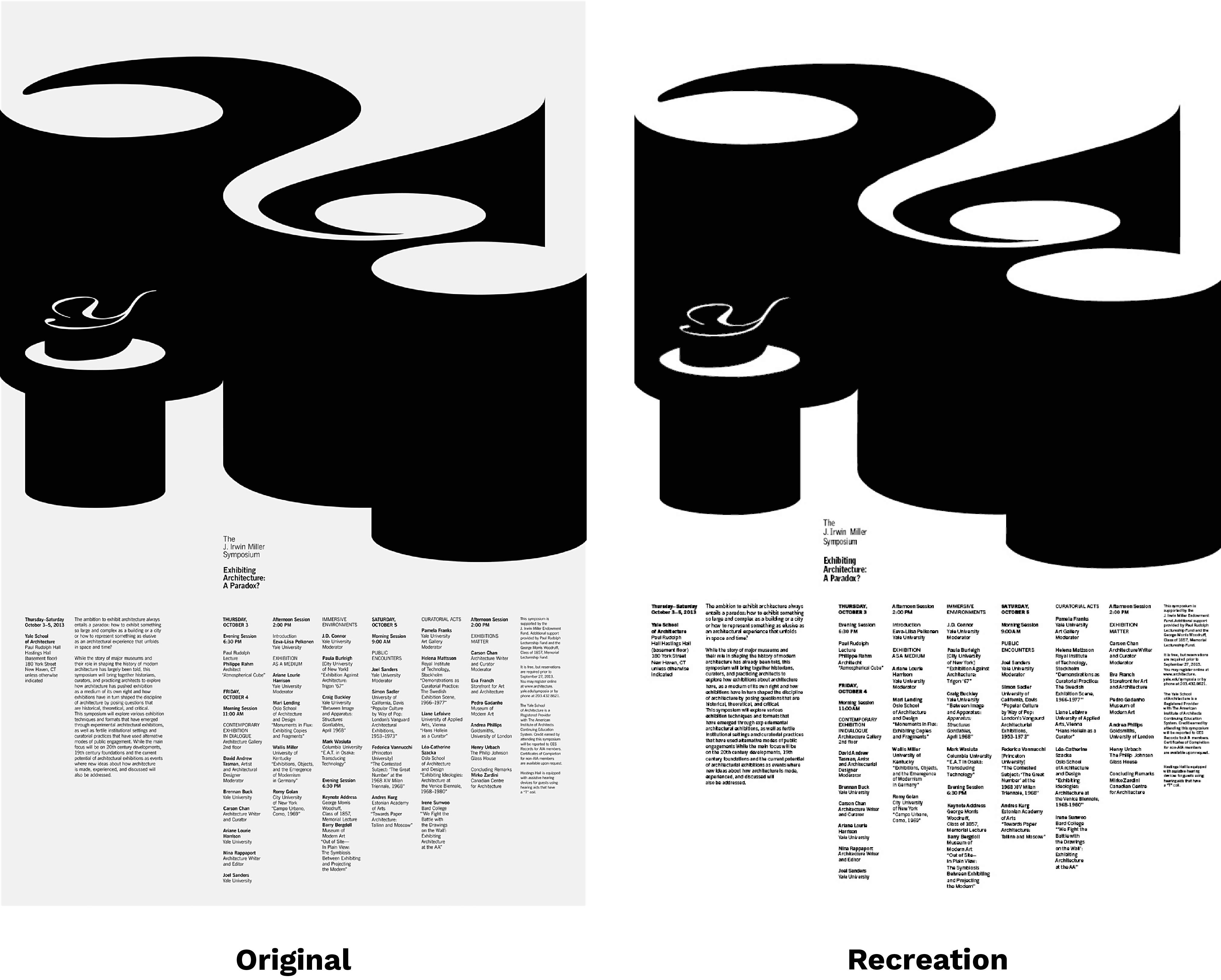
Yale School of Architecture poster by Jessica Svendsen and my recreation
The journal logo was important for creating a “blast to the past” emotion while reading. Although many designs were made, some even tried to play off Cézanne’s art style and time period. However, none felt as unique and easy to read than with the chosen logo styled as a clock. The outside was sized and formatted so that the “through” would end where “the” was located to not break the flow. While looking at “the decades”, your mind subconsciously makes a circle, playing off Gestalt’s principle of closure. Also, the idea of Cézanne’s art being influential through time was an idea I wanted the logo to show.
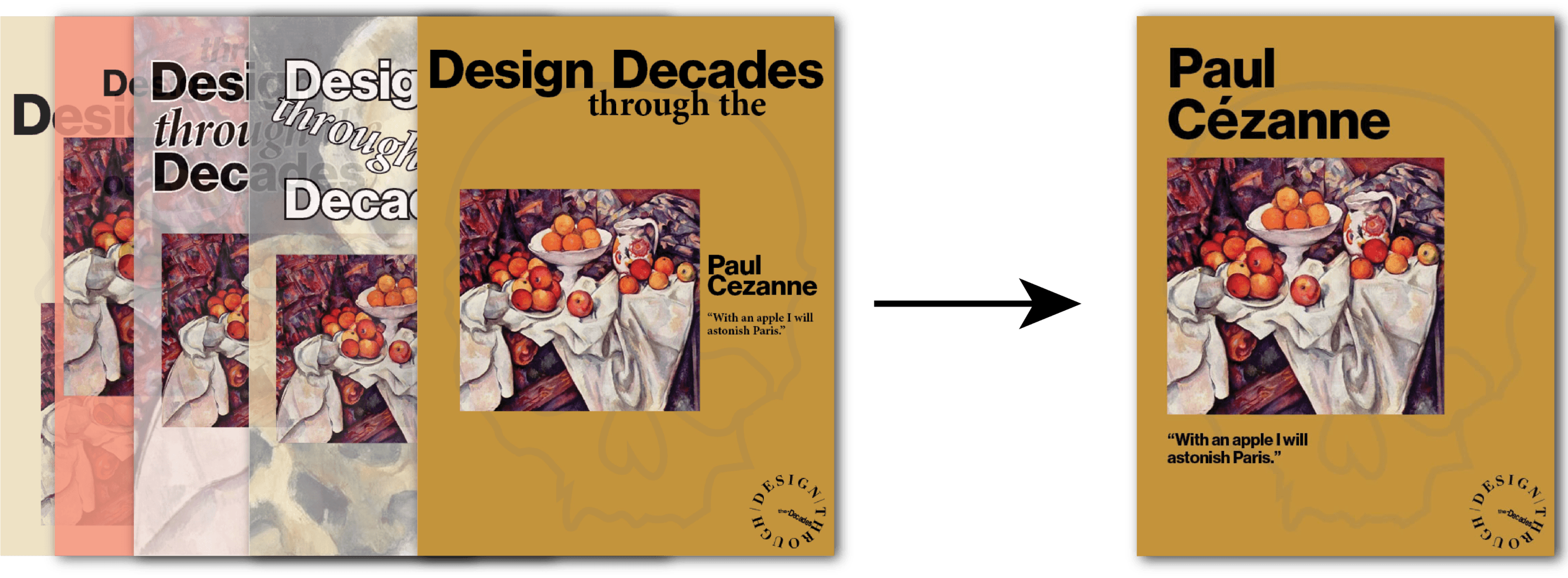
Creating a cover was difficult, as this would determine the feel of the rest of the magazine. However, I wanted to implement, “With an apple I will astonish Paris”, said by Cézanne and one of his still life fruit paintings. This was important because, as you move through the article, you learn how his earlier works were not highly esteemed, opposing what they would eventually become. To keep consistency with the internal font styles, I used the same one for my cover page.
Early drafts for the magazine cover (left) and the final (right)
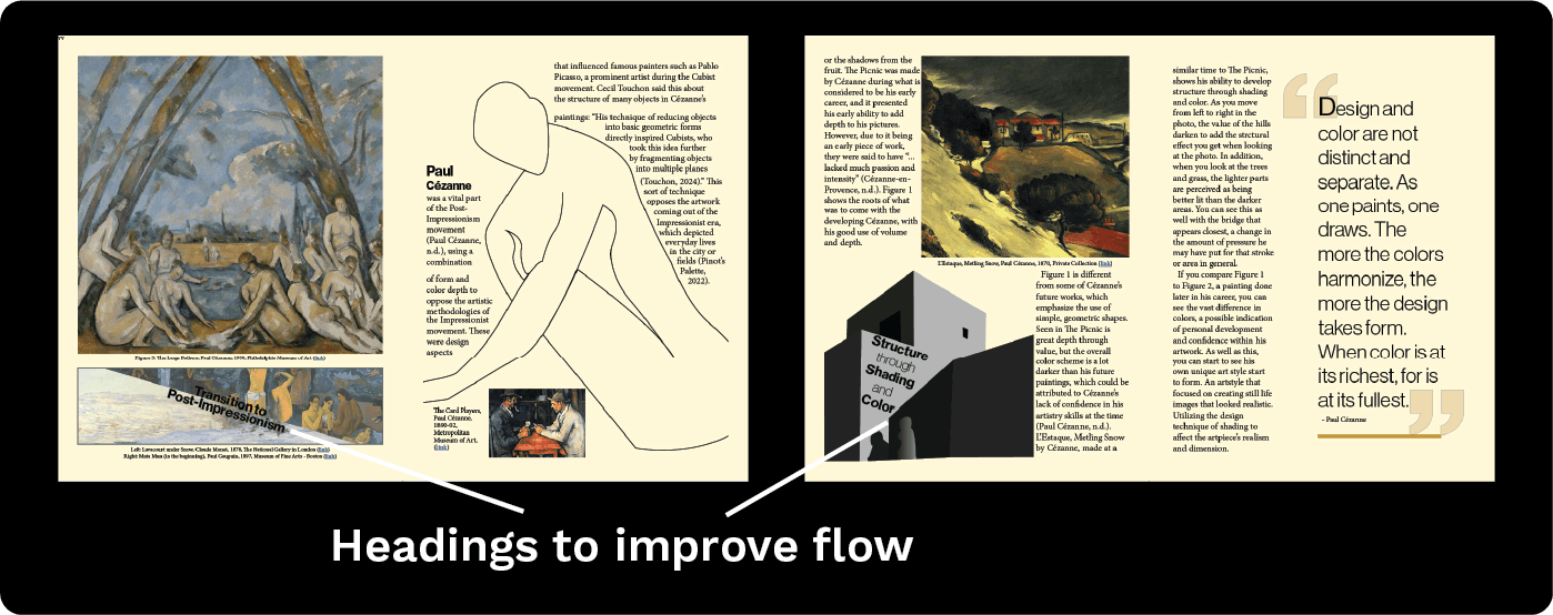
During the design of each element in the magazine, feedback was gained from the Professor and peers around me. Old drafts of the content surrounding Paul Cézanne felt surface-level and had no real direction. With the help of peer feedback, I adjusted the flow of the article by adding headers for improved guidance. As well, paragraphs and sections were moved to help fit the narrative I was trying to portray. The narrative that Paul Cézanne was a prominent Post-Impressionist artist, but had an influence on the Cubism era artists.
When getting design feedback for the cover, it initially had Design through the Decades on it. Due to redundancy and the fact that my logo was already on it, it was removed, and Paul Cézanne became the magazine's header. Insight that I gained from my internal critique was the way I formatted the text and the placement of the images/illustrations. Adjusting the placement of illustrations led to a smoother flow regarding the reading experience, another critique.
Two cases within the magazine where headings were added to help improve narrative flow
This resulted in an 18-page magazine with unique grid layouts per spread. A visual analysis of Cézanne’s famous works, what made them special, and how this had a broader impact on the art industry. As well, illustrations were made to show his unique approach to form and value. The magazine demonstrates Cézanne’s influence in both the Post-Impressionist and Cubist movements. The final magazine is on digital but also ready for print.
The Final Spreads
Full final spread of the Paul Cézanne magazine feature
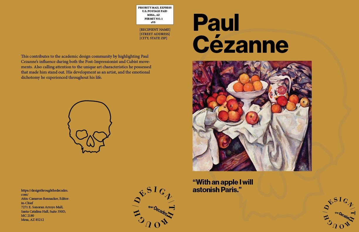
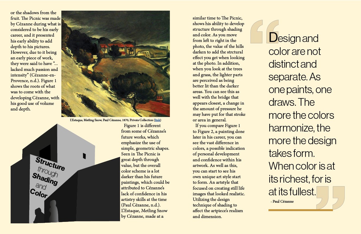
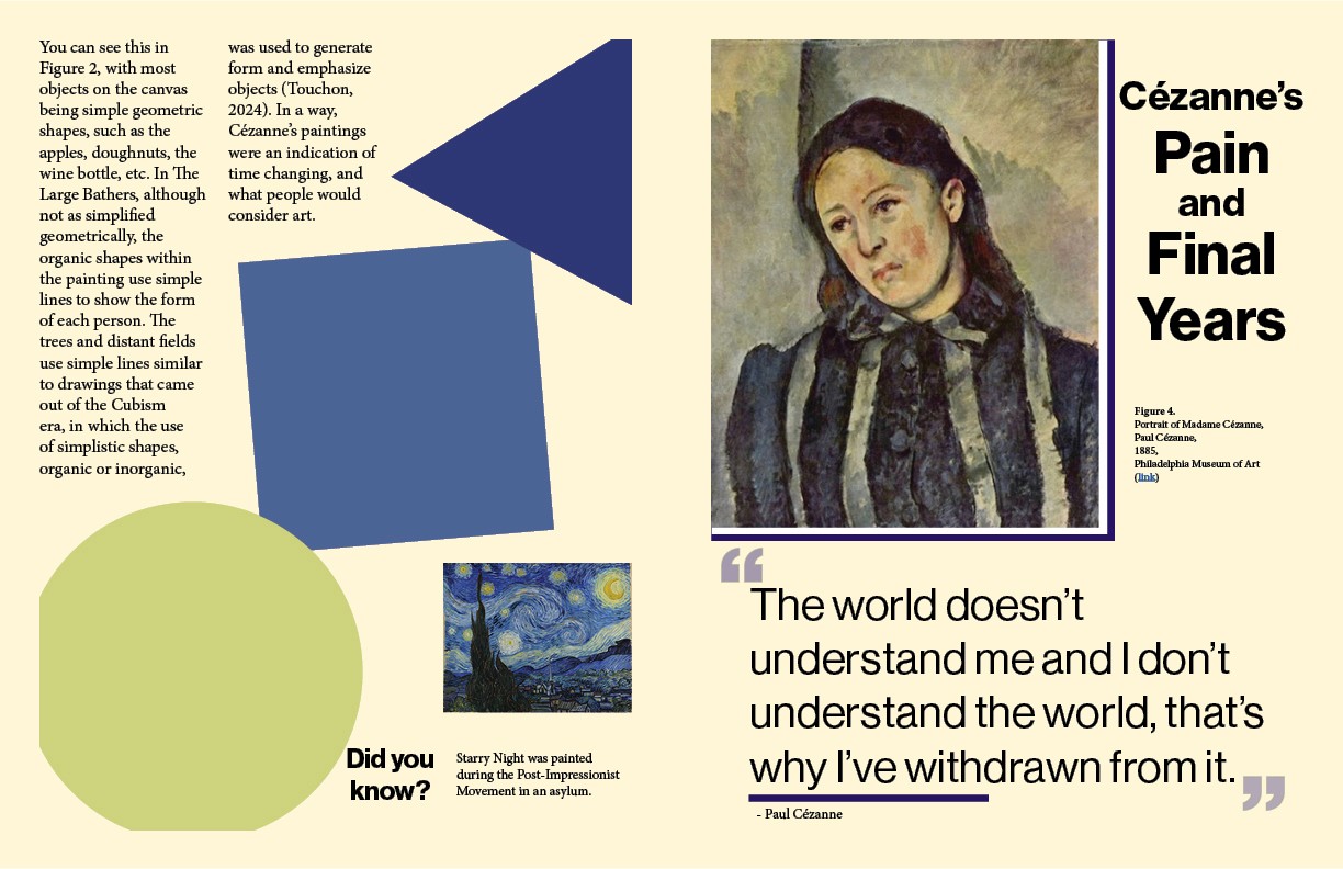
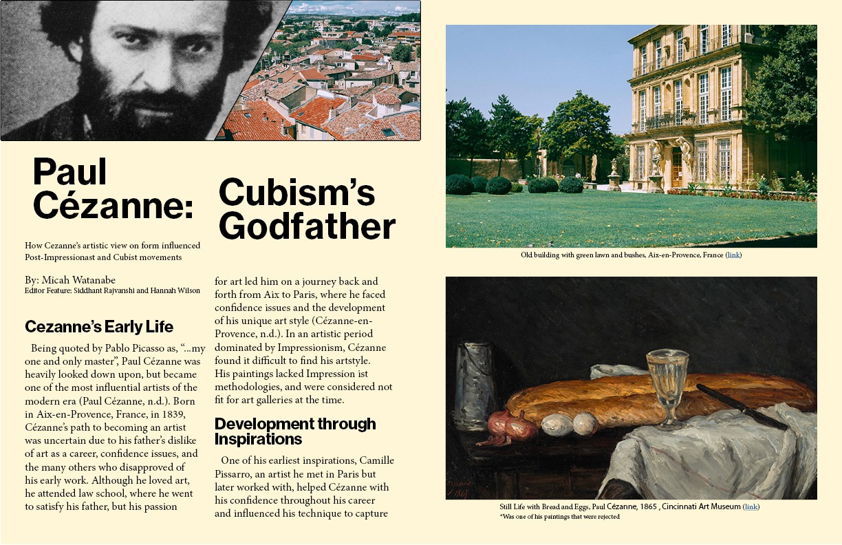
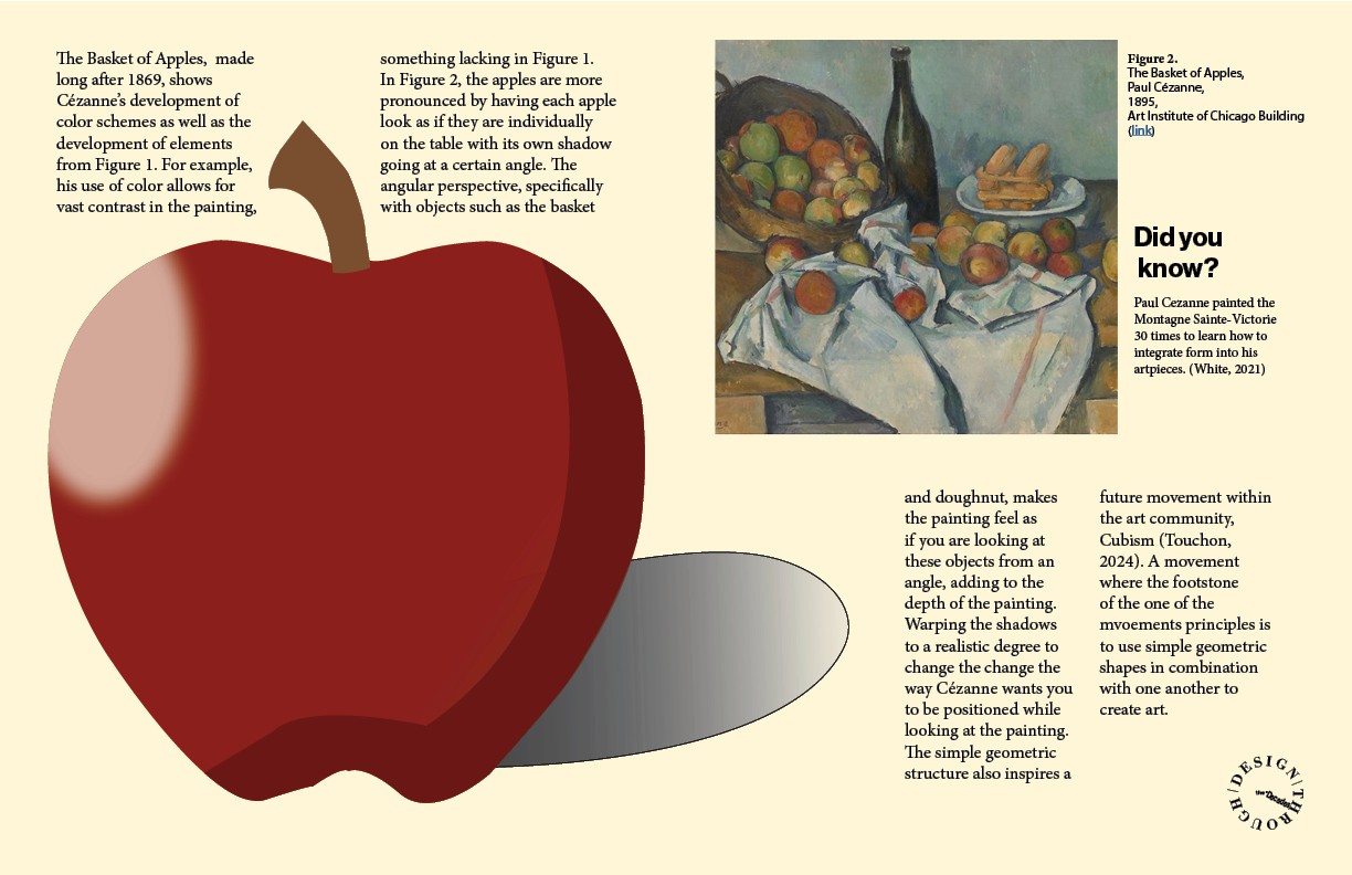
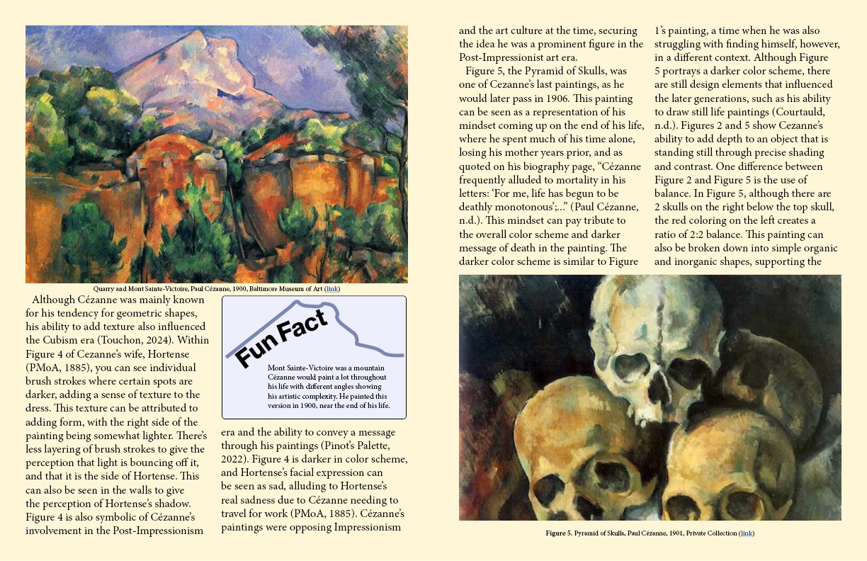
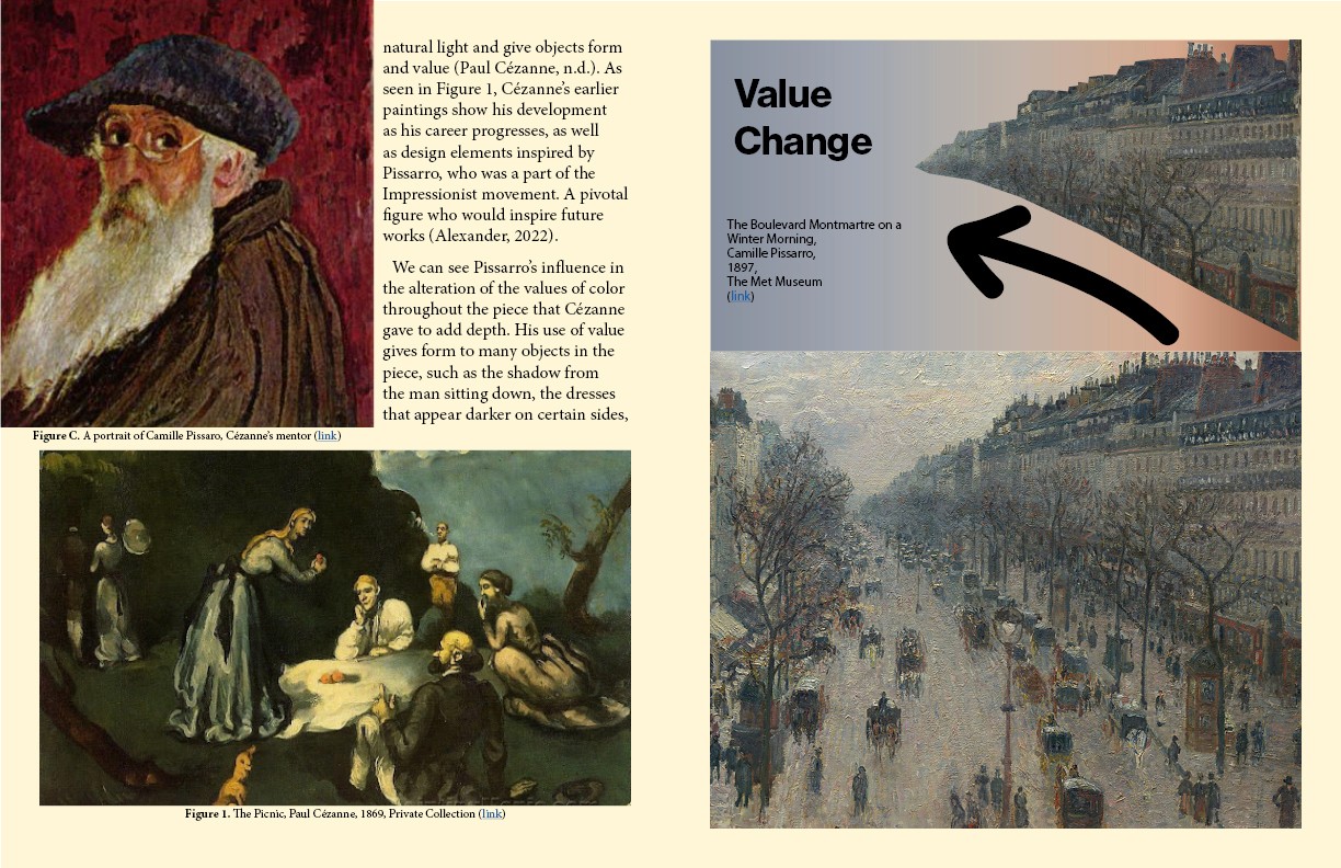
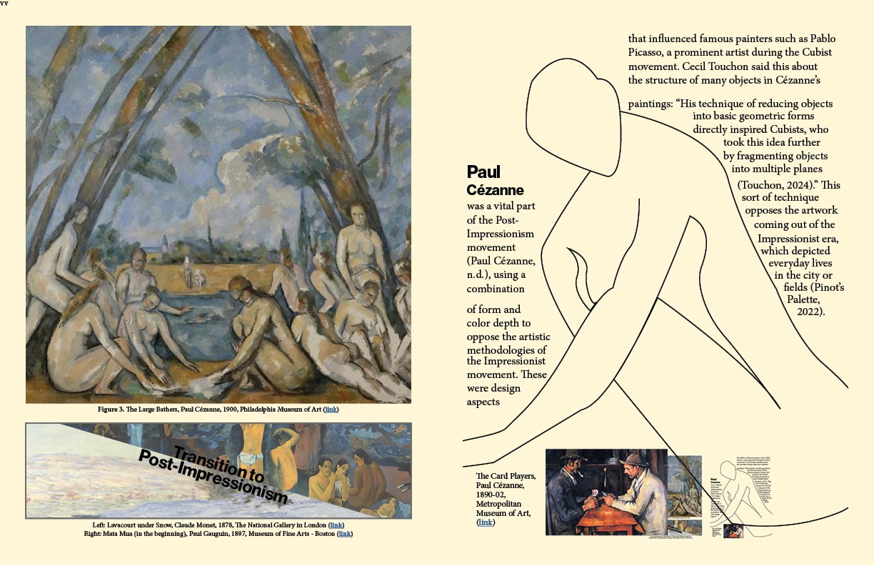
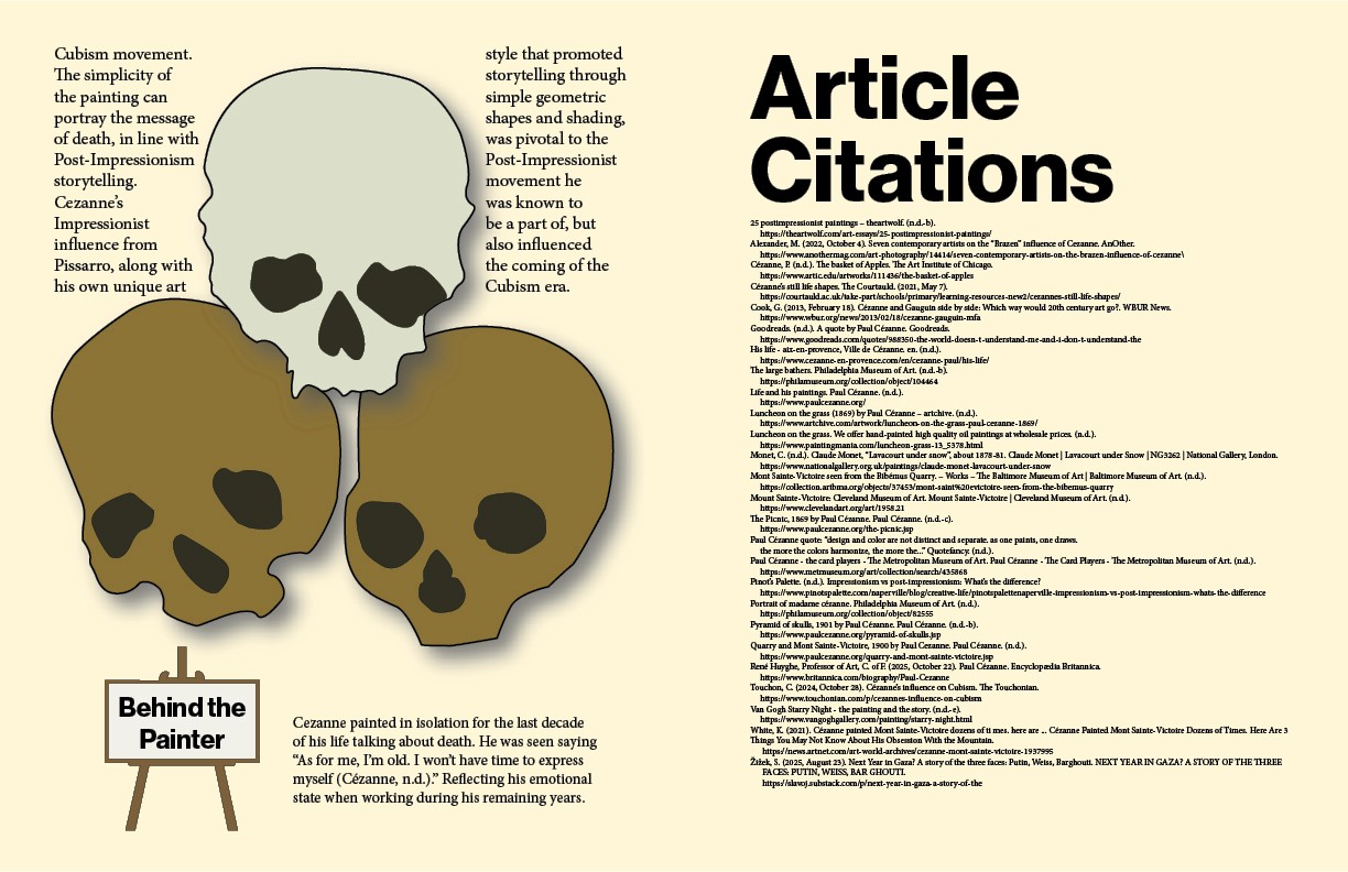
Full Spread
Developing this magazine taught me a lot about proper spacing, sizing, narrative flow, and the integration of illustrations to provide meaning. The spacing of my final magazine is an aspect that could be adjusted with some text boxes riding the edge of an image or illustration, looking out of place. Going back to my 1.5x scale I used for my font sizing, I had originally used an 8pt font for the caption and 16pt for body text. I soon learned that for print, this is far too large, and even for web, it looks large and uncomfortable on the page, also affecting the spacing issues. The readability of my article improved after adding headers and rearranging certain pieces of information. The addition of illustrations to accompany pages with a header theme made it easier to understand after talking to a peer. I was satisfied with the core content and message being portrayed; however, there are formatting and sizing issues that could be improved next time.
Takeaways
Cameron Rennacker, MS; Editior-in-Chief
Siddhant Rajvanshi; Editor
Hannah Wilson; Editor
Collaborators
Back to work
