Assistant
Web
June 2024 - March 2025 | Written by Micah Watanabe
Website built for transferring students (link)

Before my time as a Web Assistant at Oregon State University (OSU) in the Department of Enrollment Management, I was simply a Psychology student looking for a way to utilize my interest in Human-computer interaction. This job allowed me to represent my school through what others see on screen (a student ambassador as well), and it was an eye-opening career path that led me to where I am today. Before this, I had no idea what Figma was or the concept of web content management. My time as a web assistant developed my technical skills, including proficiency in Adobe Creative Cloud applications, Drupal, and Figma. In addition, under the guidance of Valyn Bodensteiner (portfolio), Web & User Experience Design Manager, I was able to gain design insight from an industry professional. Storytelling through consistent branding (Go Beavs!), long-term reproducibility of pages and assets, how to understand basic front-end coding, and more. However, one of the most important skills gained came from the opportunity to sit in on higher-up meetings. These meetings helped teach me how, as a designer, I can communicate with those of different backgrounds.
Department of Enrollment Management Homepage (link)

Eye Opening
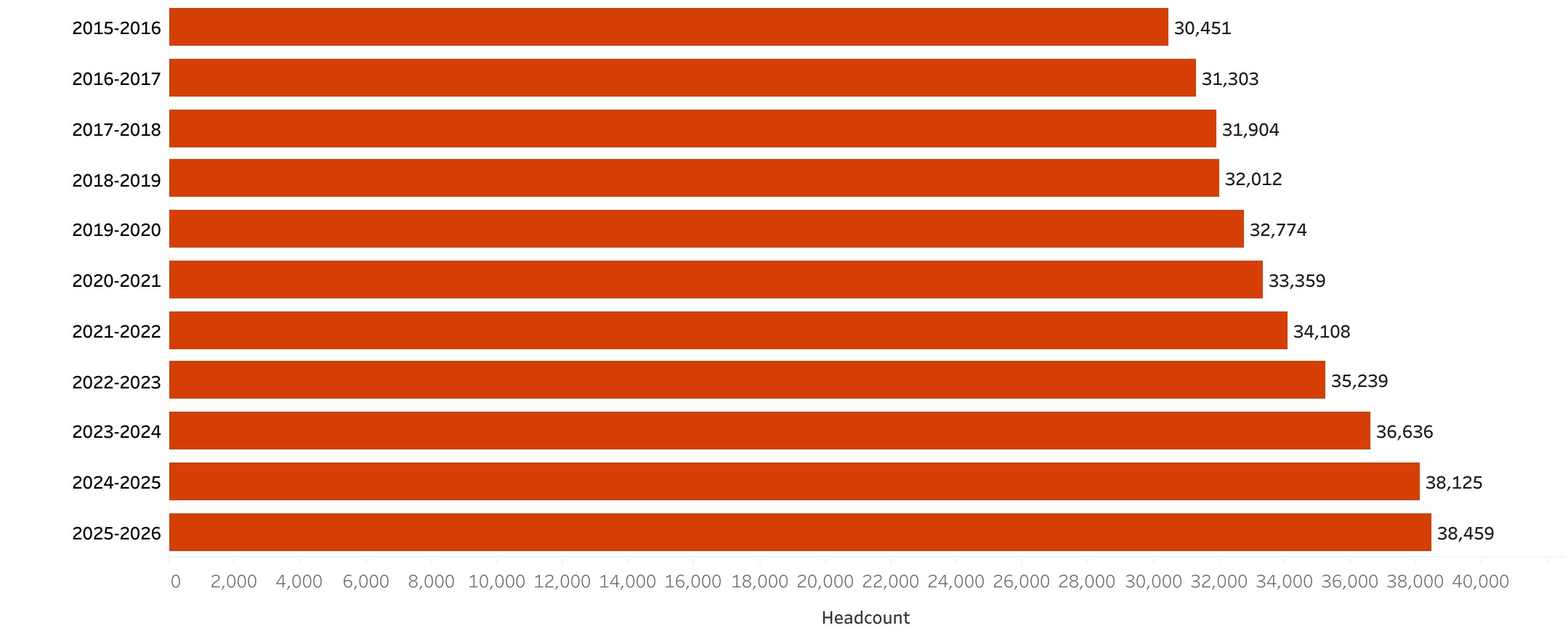
As you can imagine, with a Department titled "Enrollment Management", it comes with the use of research data. Data includes which pages were of high priority as well as what users were actually clicking (unable to show due to Disclosure agreement).
Years
Worked
Oregon State University Enrollment Numbers (2015 - 2026) (link)
During the period in which I was hired, OSU had been changing its Content Management System, or CMS, from Drupal 7 to Drupal 10. Although it is on the same CMS, the integrated 1:1 migration was flawed, and a lot of errors came with it. Pages would be migrated out of their original layout, requiring manual readjustments. However, we saw this as an opportunity to redesign old pages. Emphasizing the brand of OSU, using the user data we now have as a reference to what could be improved.

The financial aid resources and information, enrollment information, transfer students, and the OSU Stem Academy were the main websites that I worked on. This includes a full re-design according to the old content and trying to maintain brand consistency, then following this up with my supervisor. Finally, iterating on it to be checked once more for final approval.
Utilizing Research
Another part of that was emphasized to me by Valyn was accessibility. An aspect of web design that should be viewed as a way to combine users so that all can experience the same narrative flow. A part of improving accessibility was adding alt text to all images. Although at first it seemed pointless, this taught me what it truly means to be inclusive and accessible, beyond color contrast and text hierarchy. From a narrative flow perspective, alt text allows users who rely on screen readers or cannot view images to remain within the content flow of the website.
Alt Text Example
"Oregon State University students standing on a football field forming an 'OSU'"
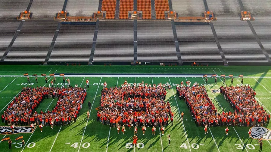
In the case of the image above, it was being used in a "Campus Life" section. The alt text, combined with the following section, enforces that idea of school pride and community that we as a team wanted to show. We did pay attention to other accessibility characteristics, such as color contrast. Earlier images showing the change in website design show a change in the header background and font, improving readability. This comes along with improved text hierarchy, as the old headers were difficult to differentiate from the body text and lacked text weight.
Accessibility
Earlier I spoke on external contributions I made for the department, such as website management. However, other projects includes creating a new style guide for other OSU departments to follow. Due to disclosure agreements I am unable to show the work done, however, this was a project needed as Adobe XD was ending, and the original style guides were created on it. I was tasked with recreating it on Figma, changing certain sections and deleting sections to improve the overall flow and reduce choppiness. This both improved my technical skills on Figma, and taught me the industry-side of branding. A way to keep a brand cohesive using specific standards of typography, colors, icons, etc.


Adobe XD to Figma
Style Guide
This web assistant job left me with a good understanding of industry standard applications (Adobe CC, Figma, and Drupal) and the real design process. Not just theory which is what I had known up to that point. Real business decisions in meetings that mattered made the work I was doing feel important and vital, but meaningful. Leaving me with a desire to become involved in a team environment where creativity can flow but in a structured, controlled environment, using data collected as a way to make our webpages or products better than those around us.

Takeaways

Back to work